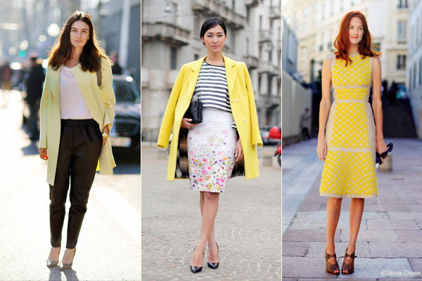
Yellow wakes up spring wardrobes
By Melanie Abrams
High quality global journalism requires investment. Please share this article with others using the link below, do not cut & paste the article. See our Ts&Cs and Copyright Policy for more detail. Email ftsales.support@ft.com to buy additional rights.
As our wardrobes come out of hibernation, a splash of yellow suddenly seems the perfect expression of optimism for spring. However, while it’s often seen as the colour of sunshine, daffodils and decorated Easter eggs, yellow is being reinvented as the new power dressing hue.
“It’s the powerful colour for powerful women who like to experiment or take risks with fashion,” says Roksanda Ilincic, whose spring/summer collection features canary yellow dresses, skirts and tops – some with geometric patterns and lines.

Images courtesy of FT.com
High quality global journalism requires investment. Please share this article with others using the link below, do not cut & paste the article. See our Ts&Cs and Copyright Policy for more detail. Email ftsales.support@ft.com to buy additional rights.
Across the catwalk, designers used different shades of yellow to catch the eye. There was Prada’s bejewelled sunflower shift and beaded bra top; Raf Simons’ buttercup balloon-shaped silk skirt for Dior (£1,450) and Burberry’s pastel yellow body-skimming one-shouldered dress with jewelled strap, and lace pencil skirt (£695), which has sold out at online retailers Net-a-Porter and Mytheresa. Even classic Ralph Lauren featured an evening dress in the same neon as a high-visibility jacket, while Céline showed yellow coats covered in bold graffiti-style brushstrokes (€7,500).
This season is all about dressing to get noticed – whether on the street or in the office – and one way to guarantee attention is to wear a colour that not only catches the eye but is also considered too bold for some. Designer Roland Mouret says: “It’s where fashion is going.
Colour is the 21st-century equivalent of black in the 1980s and yellow is pure luxe because not everyone will be wearing it.” Peter Copping, Nina Ricci’s artistic director, says: “Colours like red have become a classic like navy or black, so yellow, which is used less, has more impact now.”
Dilys Blum, senior curator of fashion and textiles at the Philadelphia Museum of Art, says: “Yellow makes a design stand out. Even if it’s just a yellow button, you look twice as yellow captures the eye.” From April 27 to November 30, the museum is showing the eye-popping designs of 1980s Patrick Kelly, including his Josephine Baker-inspired plastic yellow banana skirt. Other summer shows highlighting the lure of yellow include Van Gogh Repetitions at the Cleveland Museum of Art (to May 25), Piet Mondrian’s grids and landscapes (May 22 to September 21) at the Turner Contemporary in Kent, and the Kazimir Malevich retrospective (July 16 to October 26) at Tate Modern in London.
High quality global journalism requires investment. Please share this article with others using the link below, do not cut & paste the article. See our Ts&Cs and Copyright Policy for more detail. Email ftsales.support@ft.com to buy additional rights.
Yellow is also a viable colour in the office. Veronique Henderson, managing director of image consultants Colour Me Beautiful, says: “Women of all ages are experimenting with yellow as it shows energy and creativity.”
For Sandy Suffield, who wears bright yellow Acne boots to work as creative director of international brand consultant Wolff Olins, this season’s use of yellow also signals a post-recession optimism. “I like splashes of yellow, which show I’m not boring,” she adds. Sarah Jones, a pharmaceuticals executive whose wardrobe staples include yellow shirts, skirts and patent yellow slingbacks, says: “I’m just drawn to yellow because it’s bright and bold. Wearing yellow brings out a ‘can do’ vibe. People notice me because it’s something different.”
On choosing the right shade, stylist Maureen Vivian, whose clients include Victoria Beckham and 12 Years a Slave actor Chiwetel Ejiofor, says: “See it in natural light rather than the harsh lights of the changing room. Be honest with yourself about what you see. Pale yellow looks lovely on porcelain skin, whereas the bright yellows look better with a tan or those with darker skin tones. Alternatively, break it up with a colourful scarf or statement jewellery.”
When it comes to styling, Justin O’Shea, Mytheresa’s buying director, says: “Pare back with white for a pure look or contrast with black – say with a coat over the top – for an edgy take.” Just take care not to overdo the contrasts: the desired effect is sunny confidence, not a bumblebee costume.
Source: http://www.ft.com/cms/s/2/07894a64-c188-11e3-97b2-00144feabdc0.html#axzz2zbqF5Jng
If you would like some down-to-earth advice, give Ruth a call on (086) 226 3951
